Friday 27 February 2015

Ed Week 6: The Pleasure garden

As Lucy worked with the workers city, rather than start off with small sections of the area I  chose instead to look at where it would be situated before I started on designing it. It was decided that the Pleasure gardens would be in the centre of the city, enclosed on all sides by the buildings of metropolis. I did a couple of sketches of the city as well as a painting of it - above - to get a feel for the nested levels of it.


At this time I was also designing the buildings of metropolis themselves, these buildings would be a semi-modular way of looking at the city. Designed to be self-contained apartment buildings or offices, they would each be their own enclosed community accessible by walking or by using the public transport of the trains, trams or taxi.


initial sketches of the city and it's buildings. and the first sketch of the yoshiwara nightclub

 Around this time I started to design the pleasure gardens. Initially they were a large garden area with a central, more exclusive set of tiered gardens in the centre. Suspended above the city this garden would be a place to see and be seen and as such was not an especially private place though it contained several 'private' areas to sit and relax.

However it was soon decided that rather than two separate gardens it would be better to include the Yoshiwara nightclub in this area, as a popular place for the citizens to gather it would make sense for the two places to be connected. The garden structure in the centre became the nightclub.

When designing the gardens one thing we had in mind was the show of wealth that these gardens are meant to represent so a lot of the wealth is displayed in traditional understated ways; Water is heavily incorporated into the garden, paths are lined with small channels and waterfalls that are full of water that is clear and clean enough to drink. The plants around are clearly treated well and heavily cultivated as well and rich colours and metals are used everywhere.

In later sketches, quiet, clear sheet waterfalls are used as a means of sectioning off areas of spaces, further demonstrating the wealth that allows a society to waste large amounts of drinkable water.


Wednesday 18 February 2015

Ed Week 5: The Cathedral and it's statues

With the cathedral mostly finished the next job was the statues of Death and the cardinal sins that feature so prominently in the chapel.
 
I wanted to continue the straight lines and minimalistic silhouettes that the clothing, patterns and architexture that upper-class metropolis has shown so far into these statues and I was influenced by statues and monuments from the soviet era from architects like Dušan Džamonja and Miodrag Živković and sculptors like Yevgeny Vuchetich.
 
 
I developed the statue of death first; the statues would all follow a central design and Death at the centre was the logical place to start. once the language of the statues garments and pose was decided with Death's design I was able to go on to designing the other smaller statues.
 
It was at this stage that it was decided to make Death and Pride the same statue.


The 'cage' helmets that all of the statues wear are meant to partially cover the contorted faces of the statues and reflect the designs of metropolis. We found that with their faces partially obscured the statues became more menacing and the helmets were made to slightly resemble a skull in their design.
 
These are the final designs of the statues and the final image of the cathedral with the statues in situ:


Tuesday 17 February 2015

Lucy Week 5 - Workers City

9/2/2015: Day 1 – Finalising thin man colours
This week I wanted to start work on my second environment piece, the Workers city. Before I moved onto gathering reference, I needed to finish off the thin man design. I needed to decide on colours for his clothing. Seeing as he’s a member of the upper class elites, they have a set line of clothing that follow the same colour schemes and designs. These were designed by Ed at the beginning of the project, so I had clear reference and direction for the overall look as well as the colours.
I started with a variety of colours but mainly trying to stick around the original colour schemes put into place at the beginning. I still wanted to experiment with colour, just to see if we were missing out on anything, so below are the variations I came up with.


These are the final three I decided to mix and match. I felt these choices could vary within themselves so I went ahead and began to switch around the tops and the bottoms.
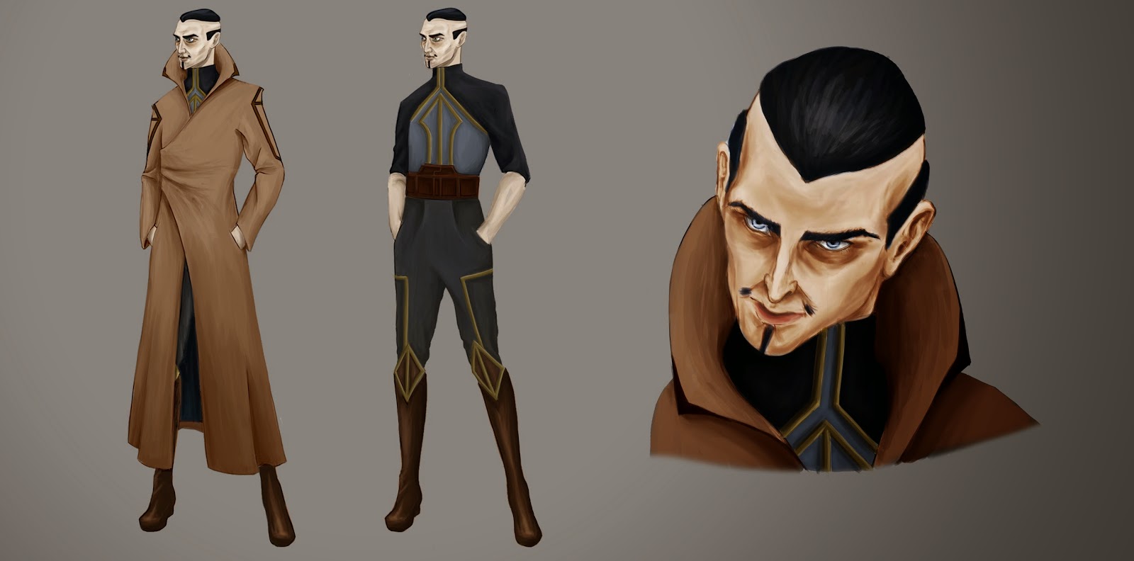

10/2/2015: Day 2 – Thin man final
So these are the final images for the Thin Man. I may go back into the headshot, I feel that the colours look a little bit washed out and need to be more saturated, but I’m really pleased with the final concept. It depicts his character well, I may try and improve the rendering but for now I really like how it turned out.


11/2/2015: Day 3 – Workers city reference gathering
For this environment piece, I’d already had a few ideas and worked on some aspects of the workers world with the catacombs environment. So using the previous reference and gathering more I began to formulate ideas (https://www.pinterest.com/ThomasJDixon/fmpminers/)
My first ideas were to do a market square type area, full of tall structures with a lot of bridges, to visually explain how the world is built one layer on top of another. Almost like the workers city was built into the foundations of the high rise complexes of the elites. I tried to do some sketches but found it difficult to form the ideas so I’ll continue tomorrow with some 3D modelling, for a white box to sketch over the top of.

12/2/2015: Day 4 – 3D modelling/work out world mechanics
I started the day with 3D modeling some scenes. As I went along I still was unsure as to what I was doing but below was what I came up with.

At this point, I was really struggling with being able to visualise the workers city. I asked Ed her opinion and she came up with the infer structure of the entire world. Below was a quick diagram that explained how she saw it.


 This gave me the understanding I needed to help understand my ideas. The main structure was how the workers get from the residential area to where they work. This was explained with the dark blue area in the diagram. They essentially are cable cars that have the seats stacked like a stair case, which the workers sit in.  They are situated on a ramp that then get pulled up into the working areas and to the heart machine. So the whole layout of the world was decided on and I began to try and 3D model a small scene that would show this.
Below is a progress shot.

 I then realized after doing this, I understood the layout enough that I didn’t really need to model the whole thing and just focus on the areas that have now been formulated. Today was spent solely to work out how the world works as a whole. Now with this knowledge I can begin to design specific areas that make up the workers city.

13/2/2015: Day 5 – Photobashing
I used the reference I gathered to generate ideas. I photobashed some images to visualise specific areas for the workers city. We broke these down into:
-Residential
-City (available food, crèches, schools etc.)
-Cable cars (to take workers to machine rooms/heart machine)
-Machine Rooms
-Heart machine
Below are the photobashed scenes.

 These have helped me understand the structure and over all look of these areas. I feel maybe I could try different levels of decor. As the elites above are in charge of these areas, I feel they may take better care of them, more so than how they appear in these scenes. This will be something I’ll explore later on, maybe try different levels of ware for some scenes. 

Monday 9 February 2015

Lucy Week 4 - Playing catch up

2/2/2015 Day 1 – Thin Man finalising
As I’m still away I couldn’t get as much work done as I’d of hoped, but I finally think I found a design that I liked. It still need more finalizing but I feel I’ve finally had a break through and found our thin man. He has a slight 1920’s feel which I like as its almost a homage to the original film that was made around that time.  Below are my near final ideas.


4/2/2015 Day 3 – Tying up loose ends…again
Now that I’m back and in the right place for work, I’ve spent today finishing off some things for Maria as well and finalizing the colour for the catacombs final. I’m doing to obviously try and get back on track with the time scale we have but to also order the work I’ve done to start working out the layout for my pages in the book. The sooner I can do this the easier it will be to make future work fit the proportions for the size book we have chosen. Below is the finished stuff I did for Maria today. 


5/2/2015 Day 4 – Tying up loose ends…again part 2
Today I managed to finish off the final concept piece for Maria. With the time I have I think it’s as good in terms of quality as I can do. I’m really happy with it and it has the desired look and feel I was aiming for.


I also modelled the theatre building based in the catacombs in 3DsMax. This was to get more of an in depth sketch of the building, to help understand the structure more. This building was originally a theatre but now is home to the secret meetings of the workers. This also made me think of symbolism and imagery that represents the workers. This imagery would be spread everywhere amongst the workers to boost morale and give them a much needed voice. So I decided to begin research into anarchy symbols and propaganda art.


6/2/2015 Day 5 – Tying up loose ends…again part 3
Today I continued with the symbolism for the workers. I decided to design a simple symbol that could be carved, drawn and printed. I thought of using the letter ‘W’ as it stands for the word workers. The symbols will be based around this shape and I also am thinking of how the city of Metropolis showcases itself. I feel I could then use this for the worker as they would defile any imagery they produce and possibly turning round the ‘M’ of Metropolis to make a ‘W’ as a sign of rebellion. Below are some the ideas.


 Now that I had a symbol decided on I could continue another image for the interior of the theatre. Below is the finished result.


 Finally for today, I decided to do a final headshot for Maria just to further understand her character. I also decided to do a map of the catacombs, which are a network of underground subways. Below was the result I came up with.


I'm going to add more graffiti and markings on the map to make it seem more worn; but for now this gets the general idea across


Ed Week 4: Beginning the Cathedral


When he realises that Maria isn't going to meet him in the cathedral, Freder finds himself in the part of the cathedral that contains statues of Death and the cardinal sins and believing that she could have found herself in danger he beseeches the concepts that the statues represent to stay away from her, keeping her safe. 
 
This week I started the environment of the cathedral, though a lot of the cathedral won’t actually be shown in the book as the scene from the film takes place in what we’re interpreting to be a large side chapel of the main structure, a showcase of the seven deadly sins and death, I started with the full floor plan of the building. Ninety per cent of the structure will not be taken beyond this stage of the concepts however it gives me an instant idea of scale and of where this sits in the fabric of the world.
Some designs got a little silly but it was an interesting exercise to imagine how people would move around the cathedral, or where they would sit to listen to the sermons. I've always been interested in the architecture of gothic cathedrals and though I found it colouring my ideas of the environment a little, it was interesting to try and construct a modern building that still held the grandeur of the gothic buildings. In the original film the cathedral is a very traditional building but we wanted to try to have a more modern construction in our concepts.
 

This is clearly the city’s main cathedral, a major place of worship and yet it has an entire area dedicated to the cardinal sins? This struck us a little odd and it was for this reason that we chose to make this area a side chapel rather than a main part of the structure. In most of the plans there is an accompanying side chapel for the cardinal virtues.
The Sins are in the chapel on the north side of the church, always bathed in shadow the north side is the perfect place for such a sinister set of statues. However it means it won’t get much light and the chapel is lit by lights from the floor, creating a close atmosphere.

Unlike the original film this is also the route that Maria takes up to the roof in our version. She runs past the statues that Freder beseeched to keep her safe as she flees her attacker by escaping onto the roof. For this reason I included the sweeping staircases in the concepts. 


 During whiteboxing I started to get a real feel for the scale of the room, but came to a problem with the statues and how they were placed; the original film has death to the left of centre in the ‘middle’ of the sins, with three to his right and four to his left, in order to create a more even and central focus I placed Pride at Death’s feet in the middle.


Saturday 7 February 2015

Lucy Week 3 - Thin Man

26/1/2015 Day 1 – reference and loose ends
Today is gonna be spent dipping in and out of gathering reference imagery for the thin man (https://uk.pinterest.com/lucytstm/fmp-met-thin-man/) as well as finishing off pieces from the other projects. Mainly the catacombs and some of the final Maria pieces.
For the thin man I wanted to make him appear very stylized but still realistic. He is a henchman for the mayor of metropolis who is told to follow the mayor’s son around to keep track of him. Therefore I feel he needs to look sneaky, understated but have a slight eerie presence. I want to take the name literally and make him thin with long limbs to accentuate his snake like form.

27/1/2015 Day 2 – Silhouettes
Today I spent taking the ref I had and visualizing my ideas using silhouettes. Below are what I came up with.


After discussing the look of the thin man with Ed, she made a point that as he would be sent to the workers city to spy on Freder, he’d need to have similar clothing to those around him; whilst still displaying his superiority over them. We decided to try and show that the material of his seeming worker clothes, is actually of high quality and more saturated with colour. With this in mind, I ‘m going to go on to further iterate on the silhouettes I have.

28/1/2015 Day 3– Photobashing faces
After trying to work on the silhouettes further I couldn’t really visualize the thin man. I had an idea in my head of how I wanted him to appear but that wasn’t what I was seeing in the silhouettes. I decided that the bulk of his character would show through his facial features. I decided to photo bash some faces to help with understanding the look of the thin man.

 We liked the strong hooded but pale eyes. It had the right amount of intensity. The original thin man from the film metropolis had very distinct eyes, which felt very haunting, like they would follow you round the room. I started to use the reference I had gathered and try to sketch out ideas with the faces I’d created.

30/1/2015 Day 5 – Further sketching

I missed a day due to travelling for personal reasons, so work slowed down for the rest of the week. I managed to sketch some ideas but again none of them seem to be working. I really do seem to be struggling with this character.


Wednesday 4 February 2015

Lucy Week 2 - Catacombs

19/1/2015 – Day 1: Reference gathering

In the story of Metropolis, the Catacombs are a secret place for the workers to meet up and discus current matters. The majority of the ‘rally’s’ are lead by Maria. We both decided early on the project, the theme and location of the catacombs. They are a network of underground unused subways that were built on top of to make way for the new city. The workers secretly dug out the subways in order to create their own hideout, which is unknown to the elites above them. This was a good basis to start working on the visuals.
I started again, by gathering images to help form ideas. (Pinterest board here https://www.pinterest.com/lucytstm/fmpmet-catacombs/ )  

I started with looking at existing catacombs which the majority are not very people friendly. Our catacombs signify the unknown hub lively with workers. Like a bustling city but underground and in secret. I then looked at pictures related to abandoned city. I used these as well as the catacombs images to photo-bash ideas. Below are some of the results.


20/1/2015 – Day 2: Photobash and sketching

Continuing with the photobashes, I began to further understand the layout of the catacombs. After photobashing I sketched over them to help breakdown each scene.


From these I could begin to see potential final images. Also, as this is a place for the workers to gather in secret fro the elites. I’d feel there’d be a lot of hatred and anger towards the elites that would be discussed in the catacombs. Therefor I may look into designing some propaganda imagery, such as posters symbolism etc. something only the workers would know about.


21/1/2015 – Day 3: 3D modelling

I picked my 2 favourite images for the final and began to whitebox the image as a 3D level. This would then be rendered then I can use it as a base for my final images. This is to help with perspective and help transfer the 3D aspects into a 2D image, hence speeding up the process and allowing for me to work accurately.


22/1/2015 – Day 4: Beginning final images

Since I have the 3D rendered images to work from. I continued to sketch over the top and begin sketching one of the 2 final images. The 2 I chose where the main area of the catacombs. All the subways lead to an old town centre where the only structurally sound building remains. It’s in this old theatre where the secret meetings of the workers take place.


23/1/2015 – Day 5: Final images continued, colour

Coming to the end of these pieces, I’m now currently working on colour. Even though the catacombs are dark due to being underground and very poorly lit. I still want them to appear warm and colourful, as they are a place of hope for the workers.


This is the final, I will probably tweak it more but for now it will do. I have some further work on the culture of the workers to do. I was thinking of symbolism, so the workers have a united identity; to appear threatening to the elites above them.